Thursday, July 28, 2016

"Today my forest is dark..." Mixed media origins layout


Hi everyone! 
Today I want to show you my mixed media  layout that's featured upon the 
"Today my forest is dark..."

In their post you will find a step by step with pictures, a List of supplies and a wonderful intro to the art therapy I've allowed myself to do so with this layout. 

I simply had to scrap the sad feelings that overcame me when my little boy had to have his first surgery. Sadly it only took a little over 2 months for his second surgery to happen because his wound wasn't healing well. (Past Monday.)
(I'm sure one of those pictures will be scrapped as well...)
Luckily we had a great week of vacation before that, involving sunshine, sea and swimming!

This wonderful new 'Mixed media origins' paper from Canvas Corp Brands called 'Grace' was the perfect basis for my layout. The wings suited my quote perfectly, as did the real butterfly wings I found during our week-long Vacation. 
Used various shades of #Tattered Angels glimmermist as well. 

So if you want to read more about the background, process or supplies, please hop over to the Canvas Corp Brands blog.

You can also find me on Facebook: lessisbore 
And Instagram: 

Comments and questions are always welcome! 
Happy scrapping!
 (Or sad, whatever makes you happy...)


Friday, July 15, 2016

Mixed Media Layout "Laid to ruins", 'Words & Paintery' Designteam July challenge


Hi everyone!

Today I'm proudly blogging about my debut as an official Words & Paintery designteam member!
I applied for their designteam call some time ago. You can't imagine how happy I was when I got mail welcoming me to the team! 
Upon seeing July's color challenge that happiness diminished a little though, LOL. The pink was especially difficult to me because I felt I couldn't use a picture of Connor. Since it had to sort of beach related I suddenly thought about Brightons "West Pier".


You can play along with our challenge until August 15! We'd love to see what you come up with! Click here!

During our first vacation to England In 1996, my husband and I visited Brighton and we were impressed by the beautiful, decaying 'West Pier'. Built in Victorian Times, as one of Britain's greatest piers. 
Ever since the 1970's it fell into neglect, crumbling into the sea brick by brick, succumbed to storms, has been set on fire. We came back several years to watch it become nothing more than a small carcass of the majestic beauty and glory it had once been.
Apparently restoring it would have been too costly. It's heartbreaking to me. 
Then again, had it not looked like a shadow of its former self, it might not have haunted me as much... 

--------------------------------------------------

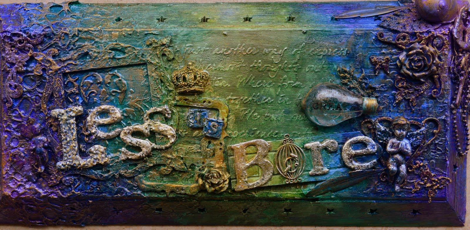
This sheet of paper is from a store called 'Action' so it's not really from a big scrapbooking brand. It suited the picture perfectly though: the colors and the scrolls that resemble the Victorian scrollwork as well as the waves.
Sadly the picture isn't mine, I found it on the net. We were never around at that hour with such beautiful skies.

To enhance the wavelike swirl theme, I used a #timholtz stencil with modeling paste. Slightly blended it with #tatteredangels #glimmermist 'Crushed Shells' but since that did not show enough, I sprayed it on some more afterwards. I sprinkled on (a little more than I wanted to) #Prima #finnabair Artstones and #13Arts glassfiller. 
Later on I sprayed the big swirl with some #tatteredangels #glimmermist 'Coral Reef'.

Sprayed some #tatteredangels #glimmermist 'Coral Reef' here and there on the paper, allowing it to drip as well. 
Using black ink I stamped a gate image all over the paper.

Then came the time to try my new #artextravagance #finnabair #rustpaste! The jars are tiny but the contents work great. I love how quickly it dries, unlike my #VivaDecor #RustyPaper. Wasn't sure how to use the yellow though, I think they should have added a patina blue to the set instead of this. But the result is like real rust! LOVE!
The figurine is from a #prima #IOD mould, by the way. And the lovely hanging clock with the beautiful scrolls is a #Scrapiniec chipboard piece. The face of the clock was covered with #onestepcracklemedium to add to its aging.

So, time to put everything in its place. Used some flowers, leaves, metal embellishments, straws, branches and for the title I used some rub on letters from #Makingmemories.

Unfortunately I had to go and lay this layout in ruins as well as the subject...
The black ink splatters that I added all over the page were too intense. Some of the paper flowers soaked up the ink and it all became a big black blur. 
Luckily there is #gesso and #Inkagold. I used 'Apricot' and 'Browngold'. Also I used some more #tatteredangels #glimmermists, 'Chalkboard French Vanilla' for splattering over the page, and for some accents 'Walnut Gold' and 'Latte'.

I will leave you with some more close-ups of my layout. If you do like it, please let me know. I didn't have enough time because of my boy who fell ill and has been throwing up for a couple of days, otherwise I would have made another one. Seriously.

If you're still interested to see more of my work you can find me on 

Happy scrapping! 


Thursday, July 7, 2016

Mixed media canvas "First...vacation"


Hey all,
Have you seen the new challenge over at Canvas Corp Brands? Are you going to give it a try? I simply adore the summery moodboard!
When asked which one of the crew wanted to provide an example, I jumped upon the chance immediately! The pictures of Connors first vacation abroad, last year, were still waiting to be scrapped. 
And this theme gave me the chance to finally give the new Mixed Media origins papers a try as well! I received them only a couple of days before so I was very curious. 
The paper feels more like a fabric and though supple to handle, cannot be torn. It needs to be cut. (Meaning it doesn't tear up easily when you get it all wet with your mediums, very good!)
So cutting the paper was my starting point, since the canvas I wanted to use was wider than the sheet. (The canvas measures 12 by 16 inches)


I adhered the 2 pieces of paper to my canvas using gel medium. The section of the Canvas that wasn't covered with paper, became my sandy path. Put gel medium on it and then bird sand (for an actual bird from a store carrying pet supplies). After allowing it to dry, I shook off the excess.


Around the edges of the Canvas and along the edges of the sand path, I applied white crackle paste.


 I let this dry overnight and then started my coloring by spraying Tattered Angels glimmermist 'chalkboard French Vanilla' on the sand path because it was too white for my liking.


For the seahorse I used two shades of Tattered Angels glimmerglam to get the perfect color, 'Tailfin' and 'Blue Topaz'. I then covered the seahorse with one step (translucent) crackle medium by Tim Holtz and sprinkled some microbeads and 13 Arts glass filler on top of it. Let it all (air) dry, sprayed some Tattered Angels Glimmermist "crushed shells" to emphasise the cracks and get a more vibrant color.


I proceeded to color the other parts of the paper with different shades of Tattered Angels glimmermist: patina for the sky, crushed seashells for the lighthouse, edges covered with crackle paste and seahorse's background, maya blue for the compass and some drips on the page.

Colored some Scrapiniec chipboard seaweed pieces with Tattered Angels glimmerglam Caspian Sea and tiny glass beads. Glued them to the bottom corners of the Canvas, let them dry and then added real seastars, shells and some small chippies like a steering wheel, anchor and seahorses.


The Canvas Corp aqua Burlap flower came on a little too strong for my taste, so I simply covered the edges with white gesso.
Underneath the burlap flower is a fabric tag, which I gave a more distressed look by brushing and spraying Tattered Angels glimmermists 'Crushed seashells' and 'Maya blue' onto it, plus a little white gesso.
Onto the tag I used tiny letter stickers for my text. (Unfortunately my initial idea wouldn't fit...)
I mounted a Scrapiniec Monograce 'F' (altered with glimmermist, glimmerglam and white gesso) onto a slice of wood and added a little seagull and some little shells. Tied the bottle filled with sand to one of the burlap flower's loose threads.


Alongside my pictures I adhered straws to create borders. Underneath the picture is a little cardstock doilie I coated with white gesso, some 'shell discs' and some sisal thread.


Wrapped the corners and sides with some netting. 
The clusters of shells are complemented by some microbeads, small 13 Arts glass beads  and flass filler and Prima/Finnabair art pebbles. Completed with a bit of white crackle paste here and there, for example on the chipboard seahorse. Followed by Tattered Angels glimmermists of course.

This picture sort of captured the beautiful twinkle that the glittermists and glass beads gave in the sunlight.

Normally I scrap more elaborate, but I didn't want to overshadow the beautiful paper. Plus the 2 pictures made the canvas full pretty quickly.
Hope I've shown you what you can do with the Mixed Media Origins papers. Questions and comments are always welcome!

Come find me on Facebook too: lessisbore
And on Instagram: mandylessisbore

Happy Scrapping!


Saturday, July 2, 2016

Mixed media heart, gift for Britt


Hey everyone,

Back to show you a project I made as a gift. My cousin Barbara used to babysit my brother and me when we were smaller, even though she was only 4,5 years older than me. We loved being with her so much that even when we were old enough to take care of ourselves we still wanted to have her over and 'babysit' us.
She became a mother of three and due to circumstances she ended up babysitting our little man one day a week during a year or so.
It's hard to explain what she means to me, especially since the time my mom passed away. Whom she had a very special bond with as well.
Needless to say she and her family are as crazy about my little man as we are about them. My cousin's daughter, Britt, treats Connor like another one of her brothers. 
With her birthday coming up, and the cute photo collages she sends me of Connor and her, it was time to make her a special gift. I asked what picture of Connor was her favorite and then I went to work.
I'm so happy with the result I hate parting with it ;)

As a base I used a heart shaped canvas, about 12 inches high. Using gel medium I adhered a 13Arts paper to the canvas. "Blue Mood" from the "Out of the Blue" series. Soon as I laid my eyes upon that sheet I was in love.
Around all the edges I applied Prima Art Extravagance White Crackle Paste and let that dry overnight.


Using 2 different stencils I enhanced the background. The swirl stencil is Dutch Doobadoo and the other one 13Arts. My modeling paste was nice and thick and the outcome was sharp as a razor. Before removing the stencil I sprayed 2 shades of Tattered Angels glimmermist.


Throughout this canvas I used these colors Tattered Angels glimmermist: 
Mint Julip
Rolling Tide
Pearl
Chalkboard Blue Ribbon
Chalkboard Splash 

Time to start embellishing! Used a felt heart shape, paper laser cut doilie and frame, some wood words, straws, feathers, wood corner, chipboard birds and heart, flowers,  leaves and berries.

Once everything was in place I dabbed white gesso blended with a 13Arts texture powder over all my embellishments, using a sponge brush. Then I used gel medium to add Finnabair Prima art stones all over that same area, sprinkling 13Arts art sugar on top. Great effect!
Sprayed some different shades of Tattered Angels glimmermist here and there (also over the crackled edges, before I forget to mention!), finishing off with the shade "Pearl". 

There you have it. Hope you like it! I'll leave you with some shots of the final result.
Comments and questions are always welcome by the way.

Come find me on Facebook too: lessisbore
And on Instagram: mandylessisbore

Happy Scrapping!