Pages

Thursday, March 24, 2016

"Sunny Days" Mixed Media canvas

Hey everyone!

The Canvas Corp Crew had a challenge I gladly accepted: make something using spring colors, English Garden style. And I have been lucky enough to have this canvas featured on their blog! 

Luckily I still had the most adorable picture of Connor, that simply screamed 'spring'! This picture takes me back instantly to those lazy, sunny days we spent at our in-laws, in their beautiful, huge, grassy garden. Thinking back still warms me on the inside.

So here's my 'Sunny Days' canvas! I'll talk you through the steps with pictures underneath.


Obviously, I started out with a 12 by 12 inch (30 by 30 cm) canvas. The paper is from the 7Gypsies 'Take our breath away' collection. I cut off the edge to fit the outline of my (reversed) canvas. I glued the outer 'frame' and the inner section to the canvas.


The transitions from paper to canvas and some of the wooden parts of the canvas were covered in white gesso. 
I covered the sides of the canvas (and some other bits here and there) with my recently bought Art Extravaganca White Crackle Texture paste. If you're a regular reader you might have heard my experience with the Golden Crackle Paste hasn't been good. But this texture paste works like a dream. It dries quickly and actually cracks. Period.
I let the gesso and texture paste air dry for some time and then I brushed some glimmermist Olive Vine all over the sides. Yes, I dipped my brush into the bottle. Later on I splattered some droplets over my canvas as well.


Using 2 masks I created a gate and some diamond patterns on my page. I mixed modeling paste with Verdigris glimmermist and applied my mixture through the stencil using a plastic card. I didn't remove the stencil immediately, but sprayed on some Olive Vine glimmermist. This turned out better than I had hoped: the colors blended smoothly and the pattern slightly repeated outside the spot I had done with modeling paste. If you haven't tried this before, you should!


Finally I had a reason to use my gorgeous Dusty Attic chipboard vines... To color the leaves I mixed the white crackle paste with Olive Vine glimmermist and got a nice, soft green color. Once this had dried, I dabbed on some more of the Olive Vine glimmermist, to enhance the cracks and give the leaves a deeper green color.


Another score from the craft fair that my sis in law Laneen (you should totally check out her blog too! Laneen's Journey Through Creativity ) and I visited February 20: Rusty Paper.
The twigs needed a brownish, textured coat, so I figured: why not? And I really like the effect!
Almost forgot to mention that I painted the 'poles' with the Emerald  Finnabair Metallique Paint.
This really had the texture I was hoping for: like Hammerite. (The paint people use outdoors and has a grainy structure.)
The wash basin is from Prima Marketing (another embellishment waiting to be used on a special project) and I aged it by applying almost all of the blends and paints I used on this project, onto it. However, the coat of white gesso I dabbed onto it afterwards, really did the trick. Everything blended together better.


The 'Sunny days' chipboard is from Scrapiniec and built up in layers. I covered the 'stripy' parts with Golden Goddess Glimmer Glam. The top part of the text was done with the crackle paste/glimmermist mixture, and also dabbed on with glimmermist afterwards. The text underneath was painted with Finnabair's Emerald Green Metallique paint.

The pieces of stone (chipboard) were coated with an orange/pink metallic paint first, then I painted the Golden Goddess Glimmer Glam over them.
Later I dabbed some Olive Vine glimmermist around the edges too, mimicking moss.


Okay, with most of the chipboards altered and the background ready, the time had come to play with placement. Time to break out my flower collection. I added a little at first, and then I added some more. And then even more. And then still some more, until the composition felt right.

To the background I glued some bits of off-white sisal. I made a circular 'wreath' around Connor's picture with the sisal as well. The parts protruding from the circle were dabbed in gesso mixed with a little glimmermist. Also, I ripped some pieces of the picture because in retrospective, a completely circular picture might have been more pleasing to the eye.

When all the flowers, chipboard and embellishments were in place, I dabbed everything with white gesso, using a foam brush.
When that had dried, I coated everything with Chandelier Glimmer Glam. I am not sure whether the white spots came from the glimmer glam or from the gesso, but it doesn't matter, because I LOVE it! It was like a glittery, jummy, edible snow all over my project! (Without looking too snowy, because it made it all look like candy. Delicious, fun candy. Cotton Candy.)

I will leave you with plenty of more pictures and close-ups to soak up the feeling of spring yourself. Comments are always welcome, as are questions.
You can also find me on facebook: Less is Bore!
Or Instagram.

Happy scrapping!


Saturday, March 19, 2016

"Angel" Mixed media canvas tribute

 "Though we cry tears of sadness
for the loss of our loved ones,
So the angels weep tears of joy
For the return of their's."


Hey everyone,

I'm back to show you a canvas I made for many reasons. One of the reasons is that it is the tenth 'anniversary' of my mother's death today. I can't believe how fast time goes by. Some memories fade unfortunately, while others stay put in my heart forever. I still miss her so much. Her warmth, our bond, her laughter, her naughty, funny and vibrant nature, her creativity, her advice, her hugs, our talks on the phone, our shopping trips. 
So when I saw the 'Angels' challenge' from the 13Arts blog come by, I knew I wanted to create something for/about my mom. (I even miss that I can't make gifts for her anymore...)

My mom loved angels so much, she actually became one. The poem above says it all. She believed dearly in angels, and she found comfort in knowing she was needed in heaven even more, than here on earth. Though she had a really hard time leaving us behind. She fought her battle against cancer for as long as humanly possible. And then some more.  
Watching slip her away into heaven is something I will never forget, for as long as I live and breathe. 


You still have until the 27th of March to join in their challenge!


Also, the March challenge over at the Words & Paintery blog really spoke to me. You still have until April 15 to join in! The colors really inspired me to use them on my angel canvas. My mother was a very feminine woman. 
And the words? They are the words my mother used to live by. She tried to make her dreams come true and enjoyed all the little things that every day brought. She had had a rough childhood and knew she had to make her own happiness. 
Sadly these words have become even more true when she passed away at age 52. Her early death has made us realize to seize the day. Nothing lasts forever indeed.

So... where to start? 
I wanted to try to use a picture of mother collage style. So I made a copy and applied it to the canvas with gel medium. Let that dry and worked around it in the meantime.
Recently I purchased this 'wings stencil' from Sandra's Hobbyshop and thought the wing shapes would fit nicely into a heart shaped canvas. I applied gesso to the canvas first after having read that someone had had trouble with the crackle paste. Unfortunately, the gesso might have been the source of that same trouble I also experienced later on: the crackle paste was so immensely cracked, the bits were practically standing upright! I could flick them all right off. I decided to put a coat of gel medium on the canvas first, then applied the texture paste once more. This time I kept the layer thinner as well.
Luckily, the paste stuck this time.


Below you can see the result of the cracked wings. Some bits are still almost chipping off, but I sealed everything with gel medium. Which I did whilst blending it a bit with Finnabair Art Ingredients Opal Mica Powder, peach colored.


The picture came out okay, and I coated it with a clear crackle medium. Unfortunately I applied it too thickly, cracking up my mother's face too much, so I tried 'collaging' the same picture over it, in the hopes of a better result. (I can already tell you it didn't work. I could peel the picture right off, revealing nothing but the deeply cracked picture once more.)

Around the top and sides of the wings I stenciled little stars with modeling paste. I wanted the wings to stay in focus, not clutter them. 
So I decided to put the emphasis on the bottom half of the canvas, by embellishing a skirt-like shape. First I adhered a bit of lace, but I might as well not have, since it's not showing anywhere anymore, LOL. Then I added some more embellishments.
Not shown on this picture yet, is the bit I added later, above the 'waist' of my mother. I wasn't happy with the outcome of the blouse, so I covered that up mostly.


Then it was time to cover everything in gesso.


Once the gesso had dried, I sprayed, using 3 different colors. I used 2 glimmermists: pink poodle and crimson.
And for the lighter shade of pink, I used Lindy's Stamp Gang: Sunset Pink.
I set off the stars from the background with a bit of Silver Inka Gold.
I added some Prima Art Stones here and there with gel medium, and sprayed those too. For a bit more glitter I added Glimmerglam: Chandelier over the wings, the picture, the shirt and wherever else it was needed.

I'll leave you with some more shots, and hope you like it. My only regret is adding the too big cracks to my mom's head. Also I have to admit I found it difficult to embellish this one, because I wanted the wings to remain uncluttered.

Comments and questions are always welcome!
You can also follow me on Facebook: Less is bore!
Or find me on Instagram: mandylessisbore

Happy scrapping!


Monday, March 14, 2016

"Stoer (cool)" Mixed media layout


Hi all!
After a few busy weekends (and evenings in which I was too tired to do anything but reside on the couch) I finally had some time to create something again. I was in the mood to try some of my recently purchased goodies such as Finnabair's Opal Mica Powders and Prima's Graphite Texture Paste and Artstones.
And I knew just which picture and paper I was going to use for it!
Connor looked cool and sweet at the same time in this picture. I edited it a little to give it a more tough and vintage look. The graffiti paper called Hip hop  has been in my stash for a long time and is by a Dutch brand called Creamotion. It suited my idea perfectly.
Since it felt very flimsy I decided to stick it onto a piece of currogated cardboard, tearing open the middle section.


 Like almost every time, I distressed the edges and inked them. Later on I painted them some and applied some more Art Extravagance Graphite texture paste.

First I stenciled some rays using a Tim Holtz stencil, and some hearts in brick pattern with another stencil. I used the Art Extravagance graphite texture paste to do so. Wow, it's great to work with! Despite its grainy texture it is very flexible. I had no trouble applying it through the tiny bricks of the stencil. And the result is totally amazing texturewise and in vibrancy.


Now it was time to fill up the creases of my currogated cardboard. I applied gel medium first, then added Art stones in both sizes and Glass Glitter in two colours : sterling and platinum.
After that I mixed 2 shades Finnabair's Opal Mica powders with Tim Holtz clear crackle medium. I added this on top of what I had just done, thinking the opal powders would be sort of translucent. Turns out they aren't. LOL. (So after this step I sprinkled on some more glass glitter.)


The Dutch word 'Stoer' (it sort of translates into 'cool/tough') was painted with black gesso first, then I put my opal powder mixture on top of it. Later I decided the word didn't stand out enough, so I coated it with some Tattered Angels glimmer glam: Tail Fin. I bet you still can't find it now, though ;)

As a hoarder... wait, I mean scrapbooker ...;) I had kept some clothing tags I wanted to use. I altered them a little with ink and crackle medium.
Here and there I added some cheesecloth like fabric, which I stained a little at first by spraying Boardwalk glimmermist onto it.
By the way, I sprayed this shade of glimmermist a bit over the page to make it more playful and soften the contrast of the cream background and black printing. 
On the left side next to the picture I added a little piece of brick pattern chipboard, which I coated with Art Extravagance Graphite texture paste first. The gaps were filled with both sizes Art stones later.


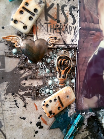
Added my embellishments like a zipper, wooden stars, swirls, dominoes, metal hearts and lamps (from Prima marketing ) until I liked my composition.
I hardly ever leave anything 'as is', so I inked and crackle glazed some items. (Lately I have noticed that the crackle glaze doesn't stay put very well. Could it be of old age? Anyone out there ever had this problem?)
Once everything was in place I splattered black gesso all over the page.

Hope you like it, as my own toughest critic I have to admit even *I* do really like this one!

Comments and questions are always very welcome.
You're also welcome to follow me on my Facebookpage Less is bore!
Or come find me on Instagram: mandylessisbore

HAPPY SCRAPPING!