Hi all!
After a few busy weekends (and evenings in which I was too tired to do anything but reside on the couch) I finally had some time to create something again. I was in the mood to try some of my recently purchased goodies such as Finnabair's Opal Mica Powders and Prima's Graphite Texture Paste and Artstones.
And I knew just which picture and paper I was going to use for it!
Connor looked cool and sweet at the same time in this picture. I edited it a little to give it a more tough and vintage look. The graffiti paper called Hip hop has been in my stash for a long time and is by a Dutch brand called Creamotion. It suited my idea perfectly.
Since it felt very flimsy I decided to stick it onto a piece of currogated cardboard, tearing open the middle section.
Like almost every time, I distressed the edges and inked them. Later on I painted them some and applied some more Art Extravagance Graphite texture paste.
First I stenciled some rays using a Tim Holtz stencil, and some hearts in brick pattern with another stencil. I used the Art Extravagance graphite texture paste to do so. Wow, it's great to work with! Despite its grainy texture it is very flexible. I had no trouble applying it through the tiny bricks of the stencil. And the result is totally amazing texturewise and in vibrancy.
After that I mixed 2 shades Finnabair's Opal Mica powders with Tim Holtz clear crackle medium. I added this on top of what I had just done, thinking the opal powders would be sort of translucent. Turns out they aren't. LOL. (So after this step I sprinkled on some more glass glitter.)
The Dutch word 'Stoer' (it sort of translates into 'cool/tough') was painted with black gesso first, then I put my opal powder mixture on top of it. Later I decided the word didn't stand out enough, so I coated it with some Tattered Angels glimmer glam: Tail Fin. I bet you still can't find it now, though ;)
As a hoarder... wait, I mean scrapbooker ...;) I had kept some clothing tags I wanted to use. I altered them a little with ink and crackle medium.
Here and there I added some cheesecloth like fabric, which I stained a little at first by spraying Boardwalk glimmermist onto it.
By the way, I sprayed this shade of glimmermist a bit over the page to make it more playful and soften the contrast of the cream background and black printing.
By the way, I sprayed this shade of glimmermist a bit over the page to make it more playful and soften the contrast of the cream background and black printing.
On the left side next to the picture I added a little piece of brick pattern chipboard, which I coated with Art Extravagance Graphite texture paste first. The gaps were filled with both sizes Art stones later.
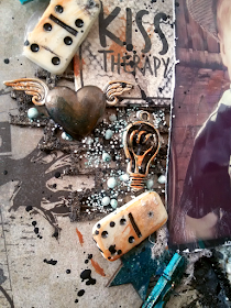
Added my embellishments like a zipper, wooden stars, swirls, dominoes, metal hearts and lamps (from Prima marketing ) until I liked my composition.
I hardly ever leave anything 'as is', so I inked and crackle glazed some items. (Lately I have noticed that the crackle glaze doesn't stay put very well. Could it be of old age? Anyone out there ever had this problem?)
Once everything was in place I splattered black gesso all over the page.
Hope you like it, as my own toughest critic I have to admit even *I* do really like this one!
Comments and questions are always very welcome.
You're also welcome to follow me on my Facebookpage Less is bore!
Or come find me on Instagram: mandylessisbore
HAPPY SCRAPPING!


Wow what is this an amazingly gorgeous layout. Love the colors and the way you used those embellishments and ingredients of finnabair. Love love love it. This is my new favorite
ReplyDeleteThank you so much sweetie ♡
ReplyDeleteConnor didn't like it, he said. He only liked the little dominoes and wanted me to take them of LOL...
Thank you so much sweetie ♡
ReplyDeleteConnor didn't like it, he said. He only liked the little dominoes and wanted me to take them of LOL...